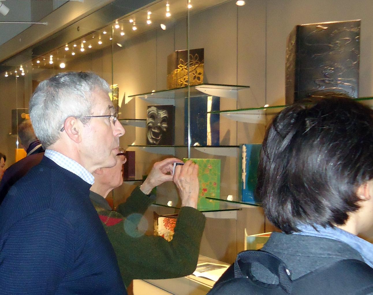
 A jolly, if slightly chaotic, evening at the St. Bride Foundation saw the annual prizes and awards handed out by our friend Glyn Farrow, St. Bride Chief Executive – crocked and on crutches but still astonishingly cheerful after his recent motorbike accident. The exhibition (open to the public until the 24th January) was downstairs, the jollification and award-giving upstairs, so there were waves of people happily wandering about the warren that is St. Bride all more or less conscious of probably being in the right place at the wrong time.

Tom McEwan
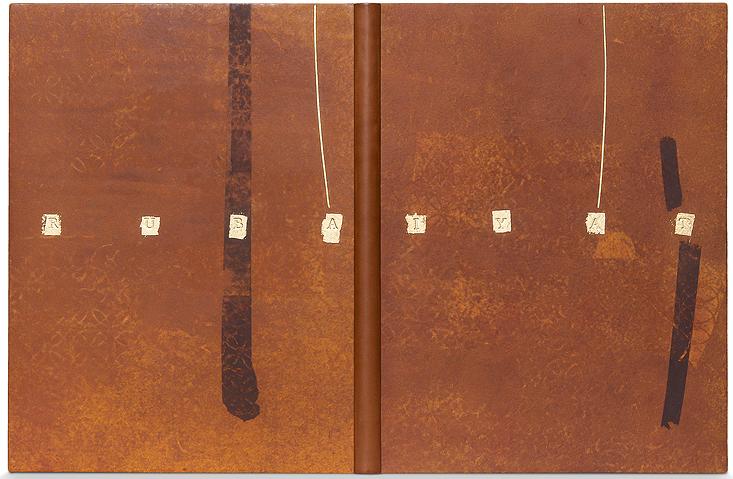
Good (at least for those of us in London) to have the event back in town after six years away at the Rylands in Manchester – and there was a suitably large and appreciative turnout. Good also to see some old friends and eventually there were enough people in the same place at the same time for Stephen Conway, President of Designer Bookbinders, to get the formal events moving. The set book was the Rubáiyát of Omar Khayyám published by the Folio Society (sponsoring the competition once more) and the entrants are also allowed an open choice book.

Jeanette Koch
Top prizes (the Mansfield Medal for Best Book, the Folio Society Prize for the set book and The Clothworkers’ Prize for the Open Choice Book) were all deservedly scooped up by Tom McEwan of Glasgow City College with his two entries – the first the set book, bound in a stunning hand-dyed goatskin, with inlays, onlays, transfer printing and gold tooling – now the eye-catching centre-piece of the exhibition – the second an edition of Huxley’s Giaconda Smile, again in hand-dyed goatskin, with inlay, transfer printing, and tooling in both gold and blind.
Ben Elbel
Also in scooping mode was Jeanette Koch, who picked up both the St. Bride Foundation Prize for Finishing and the coveted Judges’ Award (donated by Maggs Bros.) – the latter for a binding on Richard Jefferies’ Sea, Sky and Down in a delicious resist-dyed and craquelé green calf. The Shepherds Falkiner Fine Papers Prize went to Ben Elbel’s carefully crafted set book. Kate Holland, whom some us remember from her days working for Robert Frew, picked up the second Clothworkers’ prize for a luminous Paradise Lost.

Kaori Maki
The Ash Rare Books Lettering Award went to Kaori Maki for her Romantics in Wales – a powerful binding in deep blue goatskin over sculptured boards, with raised onlays.

Yohana Doudoux
The ABA’s four Highly Commended Certificates were awarded to Yohana Doudoux for her set book – a very pretty concoction in hand-dyed and embossed papers and onlays; to Miranda Kemp for a very attractive Rubáiyát in blue and gold; to Glenn Malkin for a brooding dyed calf with silver and gold-foil tooling on his When Opposites Attract, and finally to Daniel Wray (who had also won the Sally Lou Smith Prize for Forwarding) for his open choice Zen and the Art of Motorcycle Maintenance – brown goatskin, with walnut and chestnut veneers.

Miranda Kemp
There are photographs of all seventeen prize-winning bindings on the Designer Bookbinders website (www.designerbookbinders.org.uk) – but even the best of photographs conveys little of the physical impact, impressiveness and glowing presence of these superb hand-made creations. The standard was exceptionally high this year and there are many further bindings in the exhibition which must have come very close to winning a prize of their own and almost certainly would have done in other years. Many of them are for sale. Do get along to see the exhibition if you can – St. Bride is always well worth a visit.

Reblogged this on Shelf Fulfillment.
LikeLike
Lovely to see so many sumptuous bindings and thanks for the link to see them all. My only “whinge” (which goes for lots of modern bindings) is that personally I like to see somewhere on the binding the title (at least) of the book so I can feel the context of the binding in relation to the text. Otherwise, it’s a lovely piece of work but bereft of overall significance since I can’t tell what I’m seeing in relation to what is inside it (if that makes any sense). If it needs a display label to tell me it’s “The Waste Land” then when that label is not present it loses some of its power. Just my personal opinion — others may be perfectly comfortable looking as bindings as works of art without a direct connection to the book inside.
LikeLike
Dear John,
Many thanks – I couldn’t agree more. That’s why we set up the Ash Rare Books prize for Lettering some years ago – so many untitled and therefore partially anonymous bindings and, perhaps even worse, otherwise beautiful bindings marred by clumsy or wholly inappropriate lettering. But, of course, hand-lettering is a craft that needs constant practice, which most ‘art’ rather than ‘craft’ bookbinders have no opportunity for – and a wide range of tools, which most don’t have and can’t afford. This is where the old-time ‘commercial’ binderies, like Bayntun and Sangorski really score. All best, Laurence.
LikeLike