
 Wearing my hack’s hat this week, in my guise of reporter-at-large for the ABA website and newsletter. Off to the British Library, always a pleasure of course, but specifically there on this occasion to take in the press view of a brand-new exhibition: Beautiful Science. Pausing only to drop off a little something at the Map Library upstairs, in hope that it might duly be acquired by this great and august institution, I made my way to the smallish Folio Society Gallery to check out the exhibition.
An august institution, yes of course, our national library, so I suppose I was rather expecting a staid parade of the editiones principes of the great masters, leavened with the odd choice manuscript, and a morning of gentle savouring and genteel pleasure. Not a bit of it. The modern BL has fully embraced digital. Everywhere I looked it was all infographic, interactive and full of zip. Talking heads on television monitors. One fast-moving display was (I am fairly certain) briefly captioned “Models of Fog Ignorance”, which was pretty much how I was feeling at that particular point. But then I saw a book or two embracing that great, underestimated and blessed virtue of utter stillness and I knew it would be alright.
Perhaps I should have taken in the full title of the exhibition, which is Beautiful Science: Picturing Data, Inspiring Insight. Had I read my notes, I would have known that the thrust of the exhibition is precisely that of charting the history of the visualisation of science, that process of turning raw numbers and hard fact into meaningful imagery – the identification of correlation and the road to interpretation.
It’s a large and fascinating topic, but here was Dr Johanna Kieniewicz, the lead curator, to talk it through for what had by now become a rather large, somewhat motley and not altogether prepossessing crew of journalists. The concentration is on three main themes: climate, public health and evolution. Climate begins with two old ship’s logs, East India Company ships Rochester and Grenville on long voyages a century apart, but both making daily observations of the weather – the kind of data now being rigorously being mined by modern climate scientists to track eighteenth and nineteenth-century weather patterns. And there I suppose, in a nutshell, is a validation (if one were needed), of what we do, booksellers and librarians alike, preserving the past to inform the present and protect the future.

From Robert Fitzroy’s The Weather Book: A Manual of Practical Meteorology. London, 1863. © The British Library Board.
Although the word ‘infographic’ is a newish one, dating only from the 1970s, we have known the notion well enough under the plainer headings of ‘diagram’ and ‘chart’ for a great deal longer. The Climate section has some early examples, not least Edmond Halley’s 1686 map of the trade winds. Even more visually riveting was this chart of British air currents (click to enlarge) from Robert Fitzroy’s The Weather Book: A Manual of Practical Meteorology (1863), a stunning example of nineteenth-century lithography from the uncle and nephew partnership of Robert Martin and Robert Hood.
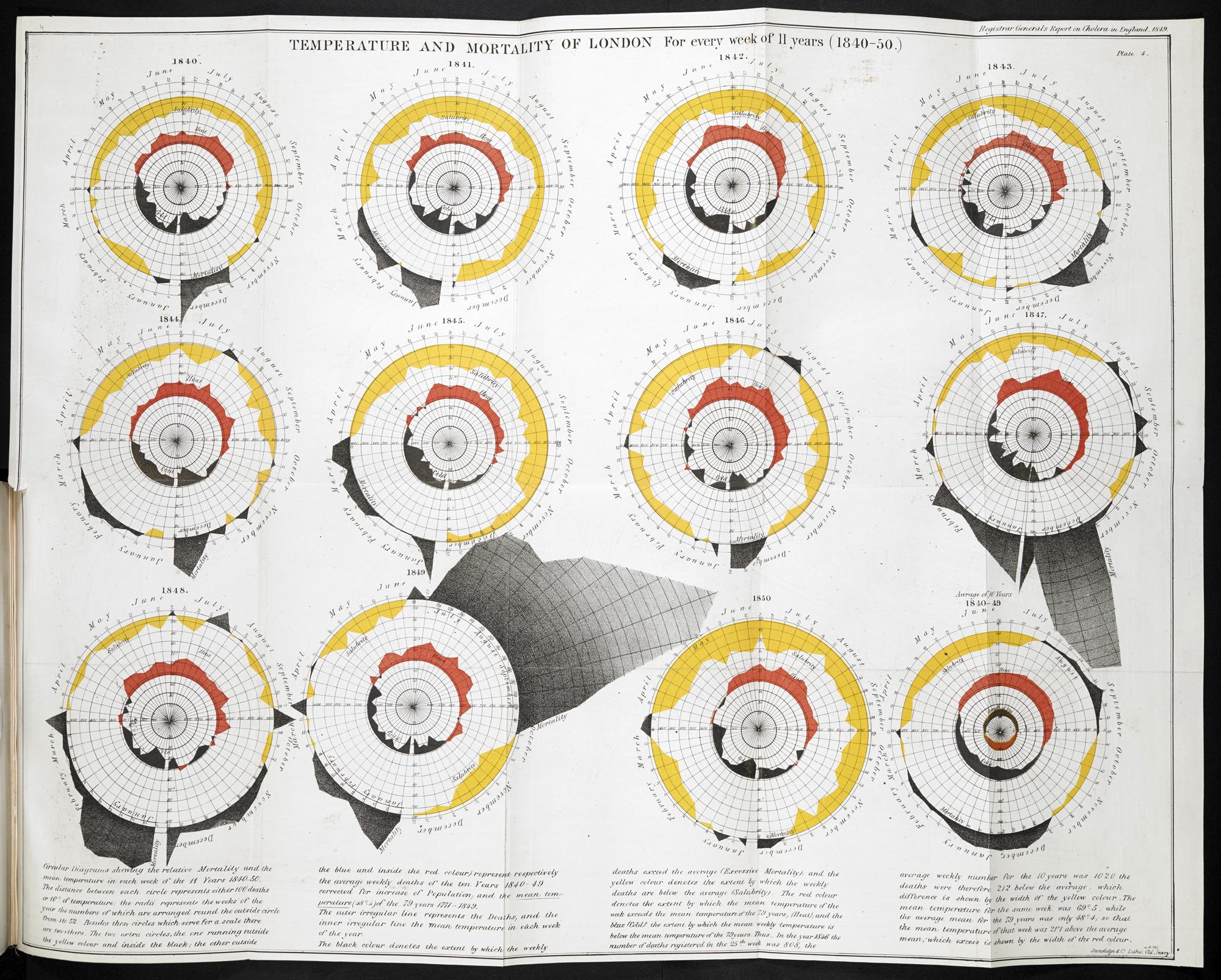
Temperature and Mortality of London. William Farr, Report on the Mortality of Cholera in England, 1848-1849. London, 1852. © The British Library Board.
I’ll pass over the Social Media Weather Sentiment chart (perceived rather than real weather) and move on to the Public Health section, which commences with the old printed Bills of Mortality, which first appeared as long ago as the 1590s. What fascinated me was a group of charts from the 1850s. Cholera was a killer without a known cause. One approach was that attempted by the statistician William Farr, who correlated temperature and mortality for each week of the 1840s in this chart from his Report on the Mortality of Cholera in England, 1848-49 (1852), beautifully executed for him in state of the art lithography by Harriet Standidge & Co. (because the advance of printing technology has a place in this story too).

On the Mode of Communication of Cholera, John Snow. London, 1855. © The British Library Board.
This wasn’t the answer to the causation of cholera, but it was a similar statistical approach that found the distressingly simple solution not long afterwards. The story of John Snow and his 1855 map plotting a cluster of deaths close to a single contaminated water supply pump in Soho is well enough known: we regard it as the founding event in the discipline we now know as epidemiology. The visualised data presented an overwhelming (if not immediately universally accepted) case. The map rightly takes its place in this section of the exhibition, but – as he usually gets omitted from the story altogether – I’ll just mention the professional mapmaker, surveyor, draughtsman and lithographer Charles Frederick Cheffins, who actually produced Snow’s map.

Diagram of the Causes of Mortality in the Army in the East, Florence Nightingale. London, 1858. © The British Library Board.
Similar in impact was Florence Nightingale’s ‘rose’ diagram from her Notes on Matters Affecting the Health, Efficiency, and Hospital Administration of the British Army (1858), demonstrating that far more Crimean War deaths were caused by appalling hospital practice than by the fighting – this of course not quite the gentle “Lady with the Lamp” of popular tradition but the real Florence Nightingale, the first woman to be elected a Fellow of the Statistical Society of London (at William Farr’s instigation) and a campaigning polemicist. I suspect she must have enjoyed getting the highly establishment firm of Thomas Richard Harrison & Sons, who worked mainly for government departments, to produce this iconic anti-establishment image for her.
We still produce public health maps and further along a 2013 Public Health England map of the density of fast-food outlets across the country claimed attention. A fairly predictable map this (in all senses), but below it was a copy of the report it comes from, lying open at another map, this one charting the incidence of deaths by accidental poisoning. Surely there aren’t enough of these to map them – but apparently there are. You really must be more careful up there in north Norfolk with whatever poisons you have been playing with.

Great Chain of Being, Robert Fludd, Utriusque Cosmi Majoris Scilicet et Minoris … 1617. © The British Library Board.
The final segment of the exhibition was devoted to Evolution. Darwin, obviously, but also his predecessors and successors – Lamarck before and Haeckel after – and here’s a strangely predictive image from Robert Fludd’s Utriusque Cosmi Maioris Scilicet et Minoris Metaphysica, Physica atque Technica Historia (1617).
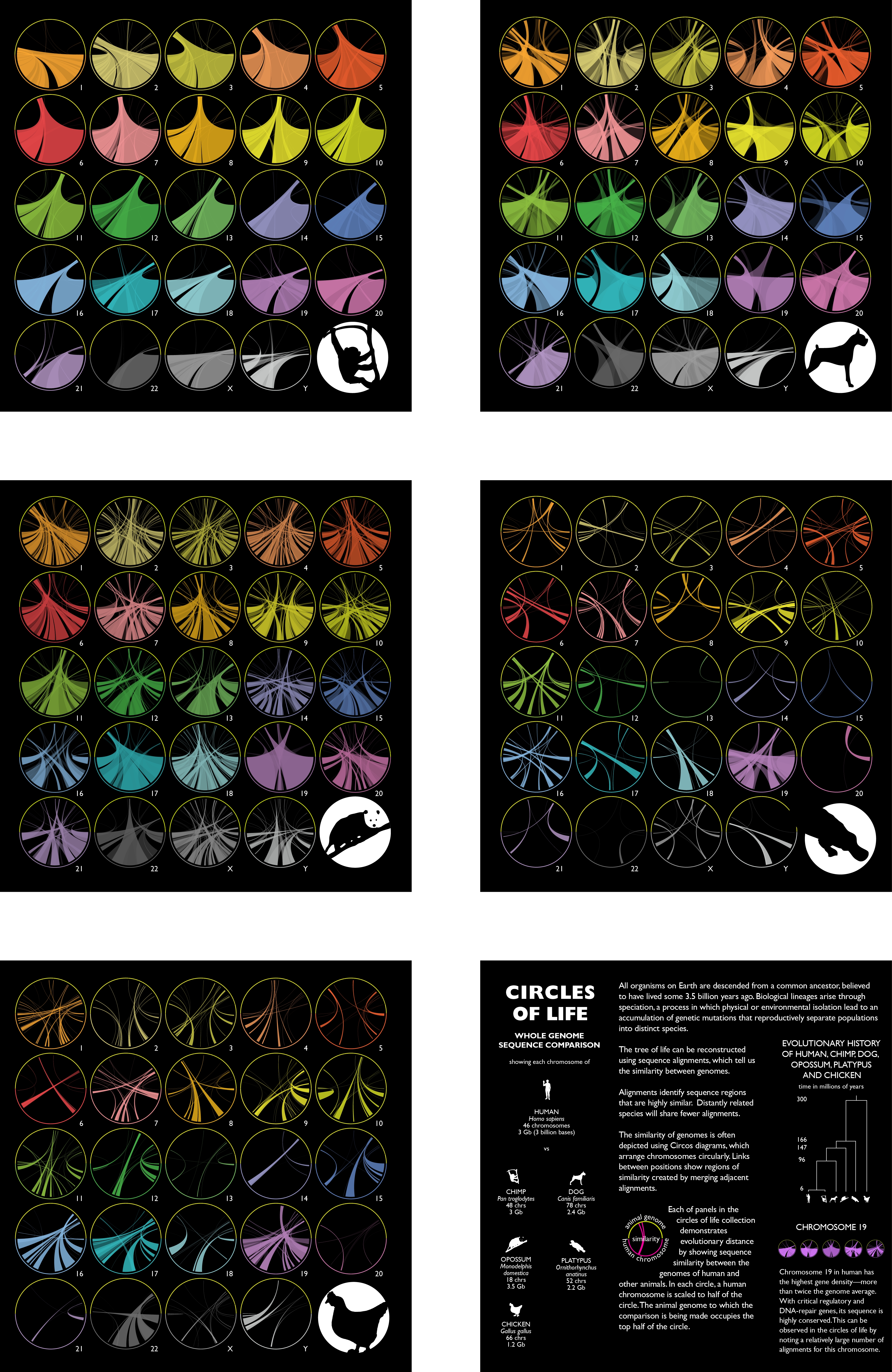
© Martin Krzywinski, Circles of Life, 2014. Courtesy of The British Library Board.
And bringing this right up to date we also had Martin Krzywinski ‘s Circles of Life (2014) showing the genome overlap between humans and various other species – chimps, dogs, chickens and whatever the hell the correct plural forms are for the opossum and the platypus – opossa? platypi?
A small exhibition: small but perfectly formed. I enjoyed this very much. You will too. And it’s free. Get along there. Beautiful Science (sponsored by Winton Capital Management) runs from 20th February to 26th May 2014. There are special events too – naming no names, but Festival of the Spoken Nerd might suit one or two of you.

Reblogged this on Shelf Fulfillment.
LikeLike